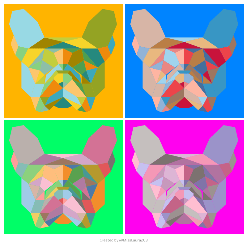
In 2017, my *Polygon Pop‑Art* blog introduced the creative use of Polygon mark type in Tableau to draw striking shapes from point lists on dashboards. Now, I am revisiting the Polygon mark type in a new project.
What Is the Polygon Mark Type?
The Polygon mark type plots custom shapes by using:
- X, Y coordinates
- Shape ID for grouping
- Point Order to define connection sequence
This method is ideal for filled shapes—from pop art to custom chart glyphs.
Data Preparation
In 2017, I hand drew and calculated my coordinates. For this new project I upgraded to a more modern approach and used a python script to prepare my data.
Python – Extract from SVG:
iimport xml.etree.ElementTree as ET
import pandas as pd
import os
from svgpathtools import parse_path
from svgpathtools import svg2paths2

# --- CONFIGURATION ---
svg_file_path = os.path.expanduser(r"C:\Users\YourUsername\Pictures\imageName.svg")

# --- PARSE SVG WITH svgpathtools ---
paths, attributes, svg_attributes = svg2paths2(svg_file_path)

rows = []

for shape_id, (path_obj, attr) in enumerate(zip(paths, attributes)):
    try:
        path = parse_path(attr['d'])
        num_points = 20  # Sampling resolution (increase for smoother curves)
        for seg_index, segment in enumerate(path):
            for i in range(num_points + 1):
                point = segment.point(i / num_points)
                rows.append({
                    'element': 'path',
                    'shape_id': shape_id,
                    'point_order': seg_index * (num_points + 1) + i,
                    'X': point.real,
                    'Y': -point.imag  # Flip Y axis
                })
    except Exception as e:
        print(f"⚠️ Could not parse path {shape_id}: {e}")

# --- FALLBACK TO POLYGONS via ElementTree ---
tree = ET.parse(svg_file_path)
root = tree.getroot()
ns = {'svg': 'http://www.w3.org/2000/svg'}

for shape_id, polygon in enumerate(root.findall('.//svg:polygon', ns), start=len(rows)):
    points_str = polygon.attrib.get('points', '').strip()
    try:
        coords = [float(c) for c in points_str.replace(',', ' ').split()]
        for order, (x, y) in enumerate(zip(coords[::2], coords[1::2])):
            rows.append({
                'element': 'polygon',
                'shape_id': shape_id,
                'point_order': order,
                'X': x,
                'Y': -y
            })
    except Exception as e:
        print(f"⚠️ Could not parse polygon {shape_id}: {e}")

# --- EXPORT ---
df = pd.DataFrame(rows)
df.to_csv("svg_coordinates.csv", index=False)
print("✅ All coordinates saved to svg_coordinates.csv")
This ensures each polygon is correctly grouped and ordered.
Build the Worksheet
- Load your
.csvinto Tableau, setXandYas Dimensions. - Drag
X→ Columns,Y→ Rows. - Change Marks type to Polygon.
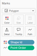
- Add:
Shape Id→ DetailPoint Order→ Path
(See screenshot below)
- Add Color using a measure or dimension to encode fill.
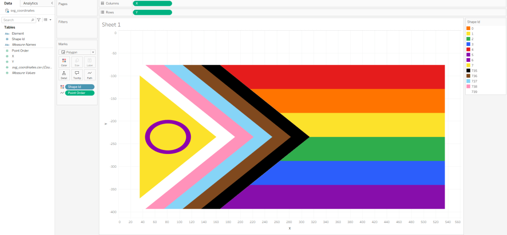
Full Dashboard Example: Pride Flag Timeline

Wrap-Up
With this updated Pride Flag project, my 2017 Polygon Pop‑Art project evolved into a powerful, repeatable dashboard process. It marries creativity with analytics, letting you tell engaging visual stories that are data-driven, interactive, and beautiful.
Resources
- Flerlage Twins guide: SVG → Polygon workflows
- DataVizFairy blog: Disney Castle tutorial

Leave a reply to Dario medina Cancel reply